Hey there! I have finally made something that I'm super proud of and looks pretty amazing. Of course, nothing is really finished yet, but I'm think it's a good start.
This is what I envision for a cover. The only thing I want to fix is the lettering on the bottom because it is very hard to see. I love how the yellow in the glasses matched the yellow in the letters. Right now, I'm working on my table of contents and it's coming out pretty nice.
I want to get back to class, so I can discuss my ideas with other people and get some feedback on what I can change to make my magazine better. I still need to start on my two page spread, but I think I'm on track and will get it done. Anyway, glad I made some progress.
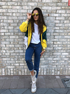
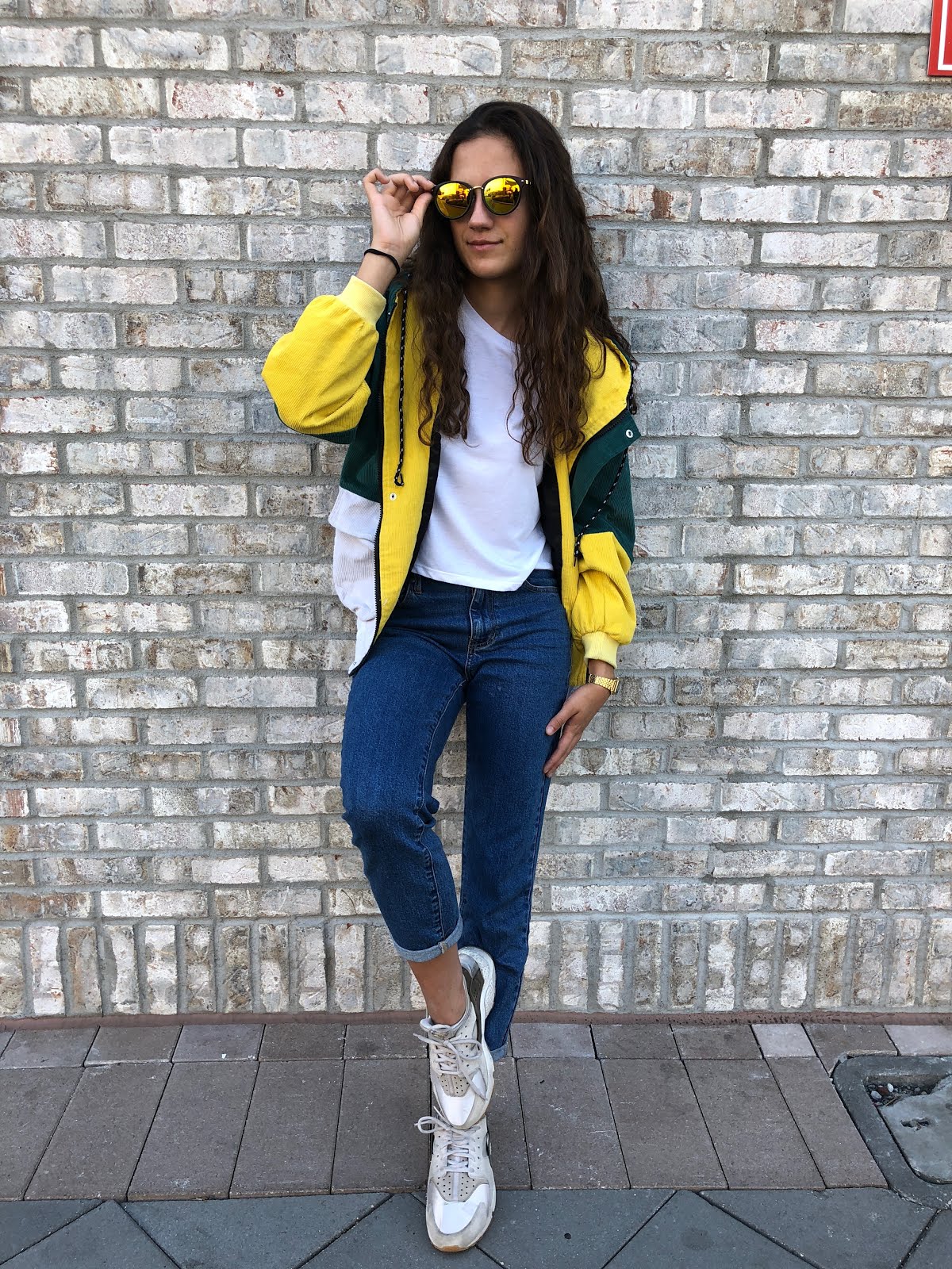
Guess what! I finally had my photoshoot and ahhh the pictures came out nice. Sadly, I wasn't able to go to Wynwood like I had originally planned, but I made it work. I went to this park near Davie that is an ideal spot for photographers according to Yelp and also went to Sawgrass Mall and captured some pictures there. My friends were also amazing because they really went all out for me even if photoshoots aren't their strong suit.
I obviously need to edit the images, but here are some of my favorite shots from the photoshoot.
They are definitely the vibe I'm going for and they came out pretty nice. I'm excited to edit them now, so the tones and colors are similar and that way they look more cohesive in the magazine. I also made sure to incorporate color in either the clothes or background in order to be able to match my text with the colors in the images. Alright, that's it for today. I am extremely exhausted from driving everywhere (through state road 84 since I'm not allowed on the highway).
Hey there guys! So I continued playing a little more with Canva and started trying to figure out a layout for my magazine. Like I said I wanted to play with color (specifically red because I think its bold and draws attention) and the magazine is also editorial so I wanted to make the layouts unique.
I came up with this as a layout for the table of contents. Obviously the picture doesn't belong to me, but I wanted to see what an image would look like in this type of layout, so bare with me.
Each bar will have a different page number and the name of the article. Of course, this isn't my only idea, but this is something I wanted to try out and see how people perceive it.
I am also debating whether or not to use Roman numerals instead of page numbers and rather divide the magazine into sections rather than state where every article is. I feel like this would be possible because Made In is more editorial allowing it to be a little more free with how the pages are laid out in the magazine. I will continue to play more and flow my ideas through the blog.
Also, hopefully I can get some pictures tomorrow because I want them all by this week. Now if you will excuse me, I need to get back to it so, see ya!
Hey guys! Today I helped my friend Sabrina with her photoshoot and in return she is going to help me with mine. I came over to her house and we created donuts, tacos, and guac (yum). It was oh sooo good. I helped photograph different food creations and let me tell you it's really hard.
We spent about a good three hours cooking and photographing food. Now I'm in a food coma and extremely tired but, you know what, you have to do what you have to do for AICE Media.
Yesterday, I went shopping for some cool clothing items to use during the shoot. So far I have only been able to get girl models which kinda sucks but, I think I can work with it.
I also started playing around with Canva and made a layout for the cover of my magazine.
I want to be a able to incorporate a color in the text but I'm not sure if I am going to do red. It all depends on how my pictures come out.
I'm also not sure how I feel about the bold text, so I am going to search for different fonts to see what I prefer. I just need my pictures like yesterday. This is so frustrating. Aghh!! Anyway heres a sneak peek ;)
I figured out a day to go and shoot. Hopefully, my dad could take me and a couple of friends to Wynwood on Monday (at least that's what he said). I'm planning on bringing my mom's Canon in order to take better quality pictures.
Also, I have come up with some questions for the interview I am going to conduct on my model. I feel like an interview would be great for this issue because it will showcase how fashion is influencing the generation and vice versa. Overall, this issue of Made In magazine will demonstrate the fashion world is changing and how it changes people with it.
Here are some of the questions
1.What does the word "fashion" mean to you?
2.Does fashion allow people to express their individuality or does it force people to conform?
3. What do you believe in is fashion this year?
4. Do you dress based on what's in style or what you like?
5. Does media a role in creating stereotypes in the fashion world?
6. How has fashion caused a change in your life?
7. Do you think this generation has influenced many fashion trends?
8. How would you express what you are wearing at the moment?
9. Do you believe the fashion industry is a good influence to society?
Alright, so that's the gist of it. Hopefully, Monday goes as planned and the pictures turn out great. I'm praying my secret mad photography skills come to the rescue. Tomorrow I will continue playing around with the layout which has actually become extremely difficult tasks. Ahhh!!!
Hey guys, so I have finally come up with a plan. In this issue of the magazine, I am going to talk about the influencers of fashion in the U.S.A. The people who influence fashion trends are everyday people who decide to take a stand and be bold with what they wear. I have decided to do this by making the two page spread an interview. The spread is going to interview a person with a rare, keen fashion sense. I plan to either use one of my friends, but I think it would be amazing if I could find someone unknown with an awesome fashion sense. Hopefully, someone with really rad allows me to snap some pictures of them.
I have researched some areas where I would like to take pictures and possibly find my muse. All these areas are populated with people and are very decorated so the backgrounds of my pictures would look awesome. I especially love the lights of Ocean Drive at night because they would add a new element to my picture.
1. Wynwood Walls
2. Ocean Drive
3. The Bodega
I like how eccentric these locations look. The bright colors will help my reader focus on my pictures which what my magazine is mainly composed off. Also, I would like to play with similar colors in the text to pull focus to specific parts of the article.
I have come up with a layout for my two-page spread. Like I said it is going to be an interview because this issue focuses on people who are influenced and cause fashion trends. I plan to use the quote to break up the text, so the reader retains focus and doesn't get bored of too much text.
This week I plan to take images for my magazine (hopefully I find a ride and possible models) and use canva to start creating a layout for my table of contents in specific because I'm not sure what I want to do yet. Let's get it together!!
Stay tuned.
Mari
Citations The Most Instagrammable Spots in Miami. (2017, May 30). Retrieved March 19, 2018, from http://theeverygirl.com/instagrammable-spots-miami/
Recently, my class met in groups to discuss our projects and I got some insight on what exactly the others in the group thought of my project. They thought that my idea for the magazine was pretty cool and interesting, but that it would be a little difficult. That's fine, though, because I love a little bit of a challenge. The group also told me that it would be better to base my magazine in the United States for this issue because it will be easier to get images for it. I don’t want to base it in another country and then not have the images look authentic.Overall, my peers really liked the concept. I have a lot more confidence in what I’m producing because the idea is attracting the attention of my peers.
I have also decided to get the subscription for Canva and let me tell you how great it is. You can upload fonts and have access to a ton of new templates and images that ease the process of creating a magazine.
I have decided that I’m going to take spring break to my advantage and shoot in Miami(Wynwood area) to take some cool shots of some cool individuals (some I might just grab off the street). I've been really busy this week, so I'm going to take the time tomorrow to sketch all my layouts and figure out exactly every part of my magazine. I feel like I'm falling a bit behind aghh...
It’s time I start figuring out when I’m doing everything so I don’t lose track of my progress and what I need to accomplish. I have created a calendar to make a layout of what I have to do.
I have also started playing around with different applications and I have decided that I'm going to use Canva to create my magazine. My teacher had recommended a couple applications like Pages, Joomag, and Canva. Canva is very user-friendly and very customizable. I am considering buying the premium version or at least applying for the 30-day free trial to have the full benefits of Canva, for example, being able to upload my own font which is a problem I came across because I already chose the specific font I wanted my magazine to have.
I have also decided that I am going to try and base my first issue in another country if I can find the models necessary for the shoots. I have also considered Miami as great setting for photos of my magazines. I'm going to take spring break as an opportunity to go out and shoot.
I'm having an extremely rough time deciding how my layout should be. I have an extremely rough (keep in mind, I'm not an artist) drawing of my cover page. I don't know yet whether I want to base my first issue of Made In magazine in the United States or in another country. If I do decide to have it take place in another country I would have to find ways for my images to look like they are from that place. I would also have to find models that look from the place I am trying to convey. It'll be cool to try out, but I will always have the U.S. as a back up in case anything goes wrong.
I have based this issue in the U.S. The white part is where my image is to be placed and the masthead is also going to be of color. Its a very rough draft, but that is the style I want to lean towards.
I have also started researching some appealing layouts for my table of contents and my two page spread.. I know I want my images to stand out more than the actual story similar to the one below. I love the simplicity of it, yet it is very captivating. The layout also plays with differences in color temperature which helps establish the overall tone of the entire magazine. Color is going to be very important in my magazine because I want to represent the true culture of the country I am displaying in my magazine. The colors in this magazine represent modernism, yet the orange still makes it inviting.
I love how this layout uses the images and the different fonts and colors order to tell a story which is essentially something my magazine is trying to achieve. I love the use of the larger font because it attracts the attention of the people.
I think I have also decided on the font of my masthead.
Ahhh! I'm nervous, but excited because now I a have to start and try to actually piece my magazine together. Praying everything goes well.
Stay tuned.
Mari
Citations
Danielsson, N. (2017, January 27). 145 Awesome Magazine Layout Designs. Retrieved March 11, 2018, from https://www.designlisticle.com/magazine-layout/
B. (n.d.). IAG Reconciliation Action Plan. Retrieved March 11, 2018, from https://www.behance.net/gallery/14980021/IAG-Reconciliation-Action-Plan
Today was a day of innovation and creativity. I started thinking about how I want to set up the layout of Made In magazine and what fonts I want to use. I have found some possible fonts to use and have found some possible layouts for my cover. I've been having a difficult time deciding how exactly I want my magazine to look. I have used my inspirations to help decide a model for my layouts.
These are some possible fonts for my masthead.
Im going to continue looking for more but, these are the ones I've have found from 1001fonts.com that I think are pretty cool. As you can tell from my previous posts, my inspirations use simple bold fonts as their masthead in their magazines I assume so as to not draw attention from the cover picture. However, I like the cool hand brushed fonts because they seem unique which is something I want Made In magazine to achieve. I still want the attention to be on the cover picture but, I think I can figure out a way around it. I have asked around and people seem to lean towards the third and the last font. Hopefully, I'll make a decision very soon.
I also need to start deciding which application I am going to use to design my magazine and start playing around with it a little so I am familiar with the application before I start building my magazine. Time to start deciding my layout! Can't wait!
The fashion industry usually targets their magazines towards women especially those in their late teens to their mid thirties. However, Made In magazine is, like I said, a mesh between National Geographic and a fashion editorial magazines. One of my inspirations, i-D magazine targets their magazines to this age group in major cities around the world, especially those who are studying or have graduated from a creative industry like design, fashion, and cultural arts. Unlike commercial fashion magazines like In-Style and Allure, the magazines I have drawn inspiration from target both genders and a multitude of races. These magazines are meant to showcase diversity which is something I am trying to accomplish.
National Geographic is also a magazine I have drawn inspiration from. This magazine is targeted to those to intellectuals in many different fields ranging from ages of mid twenties to late fifties and early sixties. The magazine also has a strong influence from cultures from all around the world making it suitable for a diverse amount of people. National Geographic is also starting to focus on the audience of children and teenagers. According to them they're "focused on the guardians of that future: our children. Our education programs give teachers the tools they need to engage students of all ages, reveal our interconnected world, and inspire new generations of responsible citizens, explorers, and changemakers."
Another magazine I have drawn inspiration from is AnOther magazine which is “blend of high fashion and world-class photography with features on the arts, politics and literature continues to make each beautifully crafted edition a collectors’ item” Just like this magazine, my magazine will be distributed only a few times a year to specific vendors as well as through subscription in order to reach out to my target market. Made In magazine is meant to be a collectors item where they all correlate but, talk about a certain country and aspect in the world wide industry.
Collector magazines produced by AnOther magazine
In story short, Made In magazine will be targeted to both men and women of many diverse cultures and backgrounds. It will target people in their early twenties to mid thirties and possibly provoke the interest of people in their late teens. It will be more of a fashion editorial magazine rather than a commercial one and stories and interviews based on the fashion trends in a culture. Only a few editions will be produced per year (ex: one per season) and will distributed by subscription and specific vendors in major cities to reach the market of consumers that will be optimal for the the genre presented.
Stay tuned. Mari Citations F. (2016, December 05). I-D Magazine Target Audience. Retrieved March 06, 2018, from http://www.lsbu-multimedia-journalists.co.uk/nunesdasilva/2016/10/16/i-d-magazine-target-audience/ About Us. (n.d.). Retrieved March 06, 2018, from https://www.nationalgeographic.org/about-us/ A. (2011, March 04). About Us. Retrieved March 06, 2018, from http://www.anothermag.com/about-us
I'm back! I have finally figured out what to name my magazine. At first, I wanted to name it Culture. I considered this would reflect what magazine is going to offer. However, this name already belongs to a magazine and I didn't want to get into copyright issues. I started brainstorming, asking some friends for ideas, and conducting some research online to see exactly what ideas I could find that would help reflect what my magazine is about. It was actually my teacher, Tstok, who helped discover the name of my magazine and I couldn't be happier with it. So the name of my magazine is *drum roll* ... MADE IN. The name comes from the tags of clothing displaying where the product came from. This name will allow people to know that my magazine is a link between fashion and culture.
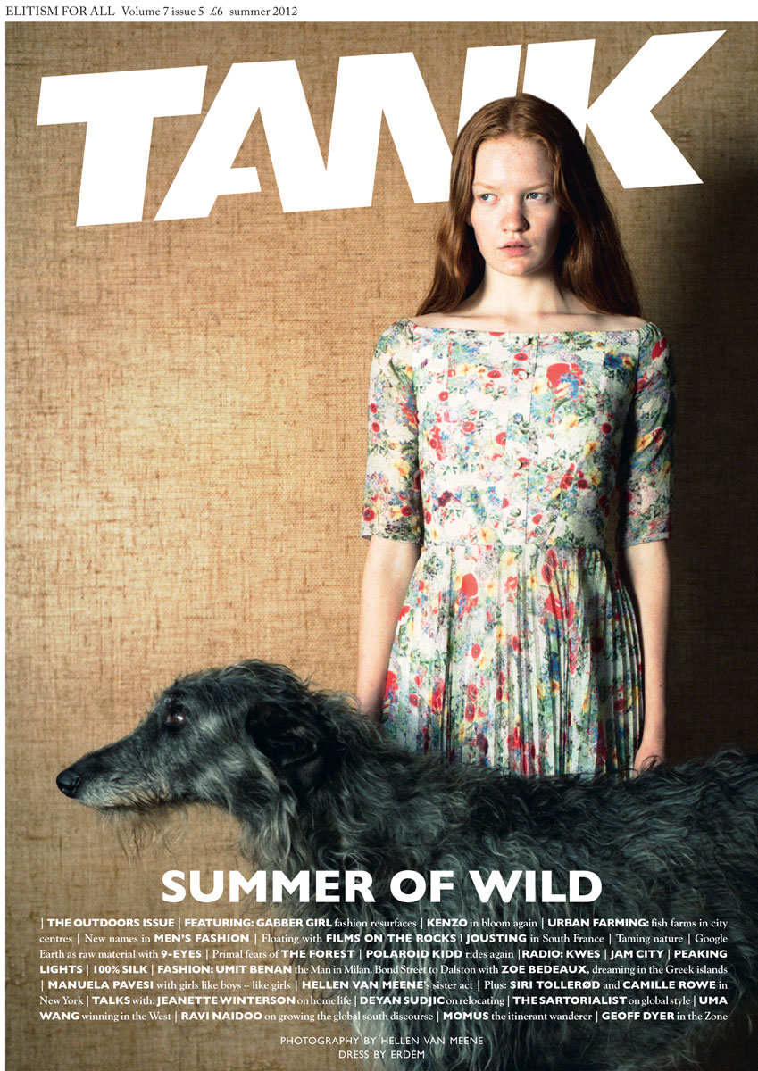
I have also continued my research on magazines with a similar genre to mine in hope of getting inspiration for a layout. I have figured that my magazine is kinda like a mesh between National Geographic and a fashion magazine, to say the least, so I have derived information from both styles.
National Geographic:history, and world culture.
AnOther: fashion and culture
Tank: contemporary culture, fashion, art
I love how the magazines showcase a person and make them the center of attention. The image base cover will allow the reader to be intrigued towards what the cover story will be about. Now I have to figure out the audience the magazine is trying to reach. Ahh!!! I'm so excited!
Stay tuned.
Mari
Citations
National Geographic Cover:
1985: THE AFGHAN GIRL (THE NATIONAL GEOGRAPHIC). (2015, February 16). Retrieved March 03, 2018, from https://thepowerofthefrontcover.wordpress.com/1985/06/28/1985-the-afghan-girl-the-national-geographic-2/ AnOther Magazine and Tank Cover: Code. (n.d.). Retrieved March 03, 2018, from https://www.thecut.com/2012/09/a-z-guide-to-indie-fashion-magazines/slideshow/2012/09/19/the_a-z_guide_toindiefashionmagazines/04-magazines-code/
UPDATE! I have found out exactly what I want to do with my magazine. I want to create a fashion lifestyle magazine that has influence from many parts of the world. Oh, no no no this isn't what you would think it is. My magazine will dig deep into the fashion trends of a specific country or culture and explain the reasoning as to why it is a trend. It all also discuss global issues occurring behind the scenes in the fashion industry. So in story short, it is a fashion lifestyle magazine but, it will also cover the "bad side" or controversy in the world of fashion.
One of the main influencers in my decision for this genre is the documentary series called, States of Undress. This VICELAND documentary explores global fashion and the issues the industry often ignores and why this occurs. I find this to be super interesting and something that is not often discussed. This documentary had me glued to my T.V. and then it hit me. Why don't I create a magazine based on this?
Here's a little snippet of the documentary so you can have more of an understanding of what I'm talking about.
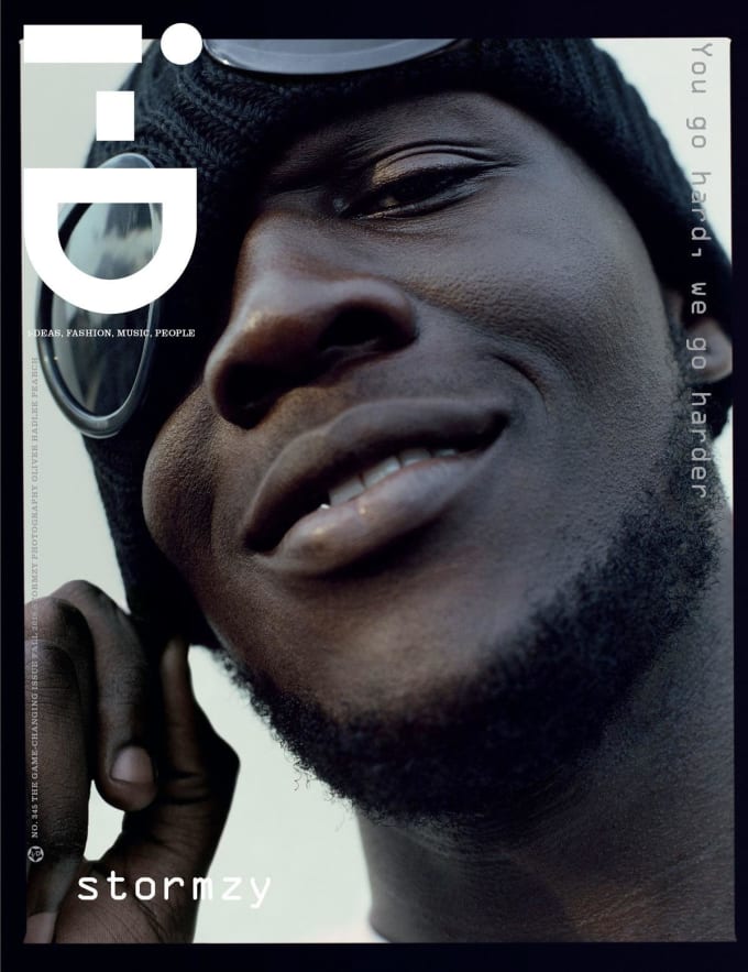
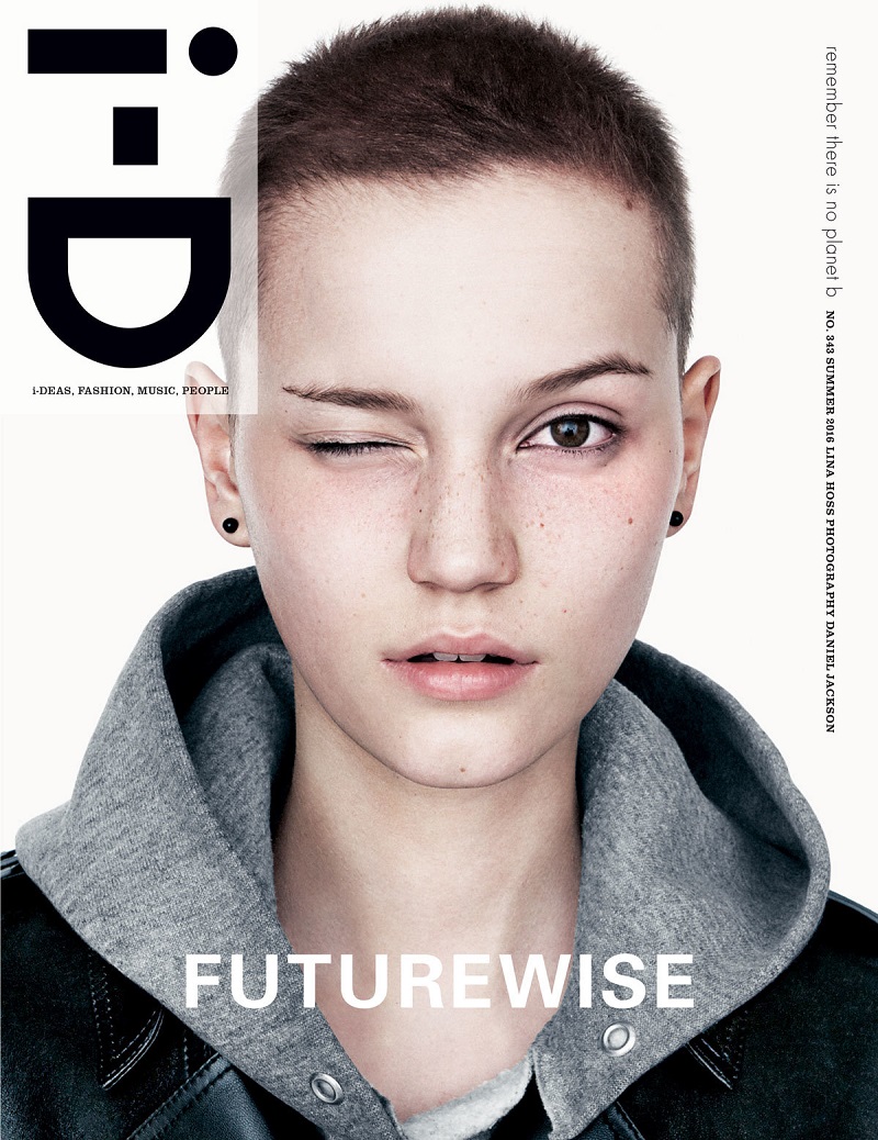
I also have couple magazines covers I can use for inspiration. All of them being from i-D Magazine which is a British magazine dedicated to fashion, music, art and youth culture. I like how the images focus more on the picture with very little cover lines instantly intriguing the audience. I do; however, want to create a few more cover lines so the reader knows what more is inside the magazine.
Something I am still deliberating is whether I want this edition of my magazine to be dedicated to a specific culture or to be about all different cultures and countries at once. I am also still a little lost on what exactly I want to name my magazine. I have a few ideas but, I will get back to you on that one. I will keep researching more magazines and who exactly my target market it, but at least I've found a genre I am truly interested in. I'm so excited for what's to come!
Stay tuned.
Mari
Citations:
The picture on the left:
Oke, T. (2017, August 14). Stormzy Becomes The First Grime MC To Grace The Cover Of 'i-D' Magazine. Retrieved March 01, 2018, from http://www.complex.com/music/2016/10/stormzy-becomes-first-grime-mc-to-cover-i-d
The picture on the right:
I-D Magazine Summer 2016 Covers - Futurewise Issue. (2017, April 08). Retrieved March 01, 2018, from https://fashionfav.com/magazine-editorials/d-magazine-summer-2016-covers-futurewise-issue/
Youtube Video:
STATES OF UNDRESS (Trailer). (2016, March 18). Retrieved March 01, 2018, from https://www.youtube.com/watch?v=qYwdWlcO43Y


")


